
Answer in brief
Expect a small working system rather than one image: a primary mark with compact, one-colour and reversed versions, an icon for favicons and avatars, a one-page usage sheet, vector masters with screen and print exports, colour values per medium, a typeface note and rights assigned in writing. Accept it only once it holds up where the logo will really be used.
Verified facts
- Inputs
- the primary mark, responsive variants, monochrome versions, colour values, type information, clear-space rules and channel requirements
- Review
- legibility at minimum size, behaviour on light and dark backgrounds, reproduction in print, file naming and suitability of each export
What a finished logo project actually hands over
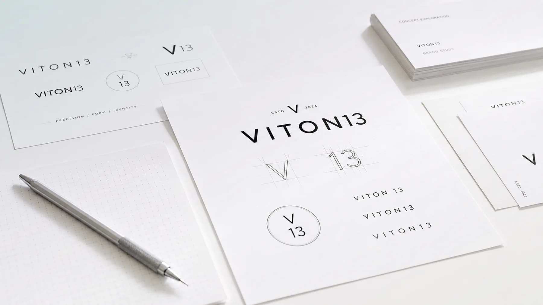
A logo design package should hand over a small working system rather than a single image. The core deliverables are the primary mark; the supporting versions your real placements need, such as a compact lockup, a one-colour version, a reversed version for dark backgrounds and a simplified icon for favicons and avatars; a one-page usage sheet with clear space, minimum size, background rules and misuse examples; editable vector masters plus exports for screen, office tools and print; colour values for each medium; a typeface note; and a written assignment of rights. Anything missing from that list becomes a question someone has to answer later, usually without the designer.
The gap tends to surface weeks after approval. Imagine a bakery that signs off a handsome mark on a slide and receives one large PNG. The web developer asks for a scalable file, the printer wants vector artwork in print colours, the shop embroidering staff aprons needs a single-colour mark without hairlines, and the social profile gets a blurry crop from a screenshot. Each request restarts the guessing.
It also helps to know where a logo package ends. It covers the mark and the rules for using it. A full brand identity, with a palette for the whole business, a type system, imagery, templates and a brand guidelines document, is a separate and larger scope, and so is legal clearance of the name. If a proposal folds all of that in, ask which parts will actually be drawn and documented.
Mark variants and the job each one does
The primary mark is the preferred configuration, used whenever space allows and the source of every other version. It may be a wordmark, a symbol beside the name or a stacked arrangement. Name it plainly in the package, because equally weighted alternatives invite each supplier to pick a personal favourite.
A variant earns its place only when a real environment demands it. Ask for one sentence per version stating where it goes. If nobody can write that sentence, the version is decoration, and sooner or later it will appear where it does not belong.
Compact and stacked lockups
A horizontal mark suits a website header or a letterhead but shrinks badly inside a square: an app tile, a stamp, a profile picture. A stacked or compact lockup rearranges the same elements for those spaces. A symbol-only version belongs in the set only if the symbol is recognisable without the name beside it.
Monochrome, reversed and one-colour versions
Many placements cannot reproduce full colour: a black-and-white invoice, laser engraving, a single-ink print run, a vinyl window sticker. Expect a solid black version, a white one for dark grounds and, if the brand relies on a signature colour, a one-colour version in it. Each should be drawn on purpose, because gradients and fine tints often collapse under automatic conversion.
Favicon, app icon and avatar crops
The smallest placements need their own drawing. A browser tab, a phone home screen and a round social avatar shrink or crop the mark until thin lines and tight counters disappear. A simplified icon on a square with safe margins keeps the brand recognisable there, and the usage sheet names where it replaces the full mark.
Usage rules that fit on a single page
A logo package does not need a thick brand book, but it does need a usage sheet that a printer, a developer or a social media manager can absorb at a glance. Its job is narrow: keep the mark intact after it leaves the designer. Suppliers skim, so show each rule as a picture, not only as a sentence.
Clear space works best when it is defined relative to the mark, for example by the height of one letter or the width of the symbol, so the rule scales with the logo. Minimum size should be given separately for screens and for print, because a mark that holds up in a sharp browser can blur on uncoated paper.
Background rules name the approved colour grounds, the treatment on photographs and the fallback when contrast is too low. Misuse examples close the page: a stretched mark, recoloured elements, an added outline or shadow, a rotated symbol, a rearranged lockup, the logo dropped onto a busy image. A handful of such pictures prevents more drift than a paragraph of prohibitions.
Masters, exports and a readable file map
The file set has two layers. Masters are editable vector sources, kept for future changes and new exports. Exports are ready files for daily use, so nobody opens design software to put the logo on a slide. Exports alone strand you at the first new size; masters alone leave the office team with nothing usable.
For websites, SVG is the natural format: MDN describes it as an XML-based language for two-dimensional vector graphics that renders cleanly at any size. Upload forms, email tools and office programs often still expect a raster image, so transparent PNG exports in a few practical sizes belong in the set. Print files, usually vector PDF, should use print colours, not screen colours.
Files also have to be findable. A name like final-logo-v7-new2 tells nobody what the file is for. Group files by version, colour mode and purpose, and add a short index of which file goes where. The formats themselves deserve a separate guide; here, every file simply needs an obvious job.
Colour values per medium and the typeface note
Colour does not travel between media by itself. One brand colour needs a screen value, usually RGB with a hex code, a CMYK value for process printing and, for solid-ink printing, a spot reference such as a Pantone number. The colour note should say which value is the master and how the others were matched, so a sign maker and a web developer land on the same brand.
The typeface note is just as practical. It names the typeface in the mark, or says the lettering was drawn or modified by hand, and records whether a licence is needed to set matching text. A suggested companion typeface for documents and the website is a useful extra, but it remains a note, not the typography system an identity project defines.
Rights, licences and trademark readiness
Receiving files is not the same as owning rights to them. Expect a written assignment or licence stating which rights pass to the business, for which uses and from when, signed by whoever holds them. Without it the company keeps a file it may struggle to defend, and investors, franchise partners and trademark attorneys tend to ask for exactly that paper.
Third-party material needs the same care. If the mark relies on a commercial typeface, a stock element or a library icon, the package should list each one and the licence the business must hold. A mark built on a font licensed for personal use only can look finished and still carry a licensing problem into every future application.
Trademark readiness is a separate matter. WIPO defines a trademark as a sign that tells one company's goods or services apart from those of other companies, and registration means filing an application with a national or regional trademark office. Searching for conflicting marks and filing belong to that legal process, not to design delivery. A careful designer may flag an obvious resemblance, but a logo package is not clearance.
The handoff test on real surfaces
Approve the package on its files, not on the presentation. Open the delivered folder rather than the slides and run the checks below with the people who will use the logo daily. Each row is a pass or a fail; a fail goes back as a named correction, with the surface attached, while the project is still open.
One standard sits behind every row. The package passes when someone who never spoke to the designer can place the mark correctly in routine situations without asking for a new design decision. Appearance was judged earlier; this test judges whether the system works once its author is out of reach.
Smallest real placements first
Take the compact version and the icon to the smallest places they will occupy: a browser tab, a mobile menu bar, a product label, an avatar beside a comment. View them on a real phone at normal distance. If strokes vanish or letters close up, the simplified icon is missing or its rule is wrong.
Light, dark and photographic grounds
Place every colour version on white, on black, on the darkest brand colour and on a photograph with bright and shadowed areas. The usage sheet should already predict which version belongs on each. Where it cannot, the rules are incomplete even if the drawing itself is sound.
Print, embroidery and engraving limits
Run the one-colour version through the production method you will use first, whether office printing, stickers, embroidery on a uniform or engraving on metal. Stitching and engraving punish fine detail and narrow gaps, so a mark that only survives on screen needs an adjusted production version before launch.
The five-situation file hunt
Ask a colleague who missed the project to find the right file for five situations: the website header, the social avatar, a black-and-white document, a large-format print and a dark photographic banner. Speed is irrelevant; confidence is the signal. Each hesitation or wrong pick exposes a naming or documentation gap that is easy to close now and painful to find mid-launch.
Practical checklist
- Open the editable master and confirm the mark is built from vector shapes, not an image pasted inside a vector file.
- Check the compact version and the icon at the smallest size your site, app or social profile really uses.
- Place the black, white and colour versions on light, dark and photographic grounds and match each result to the usage sheet.
- Compare the screen, CMYK and spot colour values in the colour note with the exported files before anything goes to print.
- Locate the signed assignment of rights and the licence status of every typeface, stock element or icon used in the mark.
- Have a colleague who missed the project pick files for five routine jobs unaided, and log every wrong or hesitant choice.
Questions and answers
What should a logo design package include?
At minimum, the main logo plus the versions your placements require (compact, black, white and a small icon), a short sheet of usage rules, editable vector masters, ready exports for screen and print, colour values for each medium, the typeface name with its licence status, and a signed transfer of rights. A package missing any of these leaves the next supplier guessing.
How many versions of a logo should a package contain?
As many as your real placements require and no more. A sensible set pairs the main lockup with a compact or stacked alternative, a solid black and a white version, and a simplified icon for tiny spaces. An extra variant helps only when the rules say exactly where it replaces the main mark.
Does a logo design package come with brand guidelines?
Not usually as a full document. A logo package should still carry a one-page sheet on spacing, minimum size, colour and backgrounds. A brand book that sets typography, imagery, layouts and templates belongs to a brand identity project, which has its own scope and schedule.
Is trademark registration included in logo design?
No. The designer can transfer rights in the artwork and point out an obvious similarity, but searching registers for conflicting marks and filing with a national or regional trademark office is legal work. Plan it as its own step, ideally with a trademark attorney, before the mark goes onto signage or packaging.
How do I check a logo package before approving it?
Test the delivered files rather than the slides. Shrink the icon to its smallest real use, try each version on light, dark and photographic backgrounds, get a one-colour proof from the printer or embroiderer you will actually use, and ask someone outside the project to find the right file for everyday jobs.