
Answer in brief
A useful logo brief states the business task, audience, exact name, priority applications, constraints, deliverables and decision owner. Describe what the mark must do before choosing how it should look. Use the checklist below to make the brief testable.
1. Describe the task, audience and exact name
Start with the problem: the current name is hard to read, customers confuse two businesses, or the mark cannot fit the first product label. Describe the audience and the decision the logo needs to support. Supply the approved spelling, capitalisation, languages and any required tagline. State whether naming is already settled; a logo commission should not silently become a naming project.
Replace an adjective with an observable need. Instead of ‘make it premium’, explain the sales setting, neighbouring offers and what the audience currently misunderstands. Treat improved recognition as an objective to evaluate later, not a result already proved by a mockup.
2. Rank the first applications and attach their constraints
List the three most important places where the logo will appear, then provide actual sizes, backgrounds and production information. A website header, profile image and printed label have different constraints. Identify essential layouts and languages rather than requesting every possible variant. Ask the relevant supplier about reproduction limits instead of assuming that embroidery, engraving or printing all follow one universal rule.
Attach current artwork, a sample of the smallest application and the background on which the mark is hardest to read. Mark what is mandatory for the first release and what can wait. This gives the designer a bounded problem and makes scope comparison more useful than comparing headline prices.
3. CONCEPT / Movement: brief for a difficult background

The existing Movement concept presents a light, solid geometric mark over a dark fitness photograph. It illustrates a contrast question, not a verified equipment client or a completed production test. A useful brief asks for a version that remains distinguishable on the specific photographs you provide, plus a plain-background alternative.
Proposed check: place the approved artwork on a representative light and dark image at its intended display size. Record where edges disappear or the name becomes hard to read. This is a test to perform for your project, not a claim that this presentation passed it. Symbols in concept artwork do not establish verified trademark registration.
4. CONCEPT / FlyFly: define the wordmark test
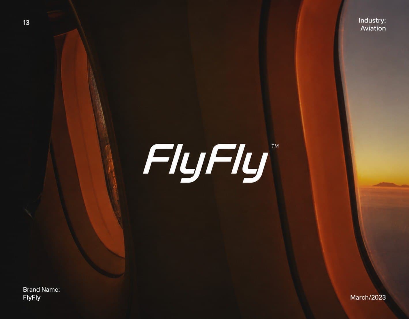
FlyFly is an aviation-themed concept presentation with a slanted white wordmark on a photographic background. The image shows a visual direction; it does not demonstrate an airline engagement, passenger use or readability on an actual boarding pass. Use it to ask which letter details must remain clear when the wordmark is reduced.
Specify the smallest real application and the viewing context. Review that size rather than a large slide alone. If the full name cannot work in the agreed space, discuss an alternate layout or a separate compact mark as an explicit deliverable. Do not quietly accept an unreadable version because the presentation looks convincing.
5. CONCEPT / PUMP DRINK: separate flat artwork from production
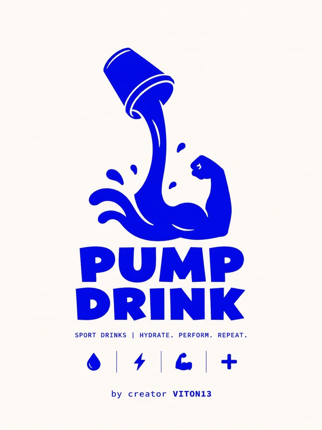
The PUMP DRINK board shows a blue illustrated mark and lettering on a light background. It is a concept, not evidence of a manufactured drink, printed packaging or a client launch. The useful brief question is whether the identity needs a version that works without gradients or multiple colours, and on which exact material.
Ask for an appropriate one-colour export if your production process requires it. Then obtain a supplier proof or test sample before accepting production suitability. A flat-colour image alone does not prove lower unit cost, identical colour between suppliers or readability at every size. Keep those checks separate from visual approval.
6. Explain references and the boundaries of the idea
For each reference, write one reason it helps: clear lettering, a useful layout or contrast on a difficult surface. Add relevant competitors and explain what must not be confused with them. Avoid asking the designer to combine recognisable parts of other marks. Visual research informs direction; it is not proof that a proposed mark is cleared for registration.
Collect stakeholder comments before the review and appoint one decision owner. Separate a failed agreed criterion from a new preference or a request outside the brief. Return one consolidated response tied to the intended applications, not several contradictory lists from different people.
7. Agree what approval and delivery mean
Write three to five observable acceptance checks. For example: the approved name is readable in the supplied header; the agreed monochrome version remains clear on the label sample; required languages and layouts are present. Use dimensions from your own project, not an arbitrary minimum copied from a guide.
List editable artwork, required vector and raster exports, colour variants and basic usage instructions. A presentation JPEG is not an editable vector master. Adobe distinguishes vector geometry from pixel-based artwork; verify the actual file, not its extension alone. Open the delivered files and check the intended applications before recording acceptance.
8. Close the brief with timing, budget and responsibility
Name the deadline, budget boundary, review participants, final approver and the person collecting source materials. Agree how many directions and revision rounds are in scope, what files will be supplied and when missing inputs must arrive. Ask whether additional languages, a tagline or new applications change the estimate before work starts.
Keep the approved brief, feedback and handoff checklist together. Record outstanding production or rights checks separately and assign their owners. The three examples here illustrate design questions only: no client relationship, manufacturing outcome, sales lift or conversion result is asserted. A clear brief helps organise decisions; it does not guarantee a commercial result.
Practical checklist
- Task and audience: describe the problem and who needs to recognise the mark.
- Name: confirm spelling, languages and tagline status.
- Applications: rank the first three and supply real dimensions/backgrounds.
- Constraints: record supplier requirements and mandatory exclusions.
- References: explain what works and what must remain distinct.
- Approval: agree observable tests and one decision owner.
- Delivery: list editable sources, exports, variants and instructions.
- Schedule and budget: confirm inputs, review rounds and scope boundaries.
Questions and answers
What if I do not know which logo style I want?
Start with the audience, problem and intended applications. Explain references in plain language; you do not need to choose a design solution before the brief is discussed.
Do these examples show real client projects?
No. Movement, FlyFly and PUMP DRINK are labelled CONCEPT presentations. Their imagery does not establish a client engagement or operational product.
Is a JPEG enough for logo handoff?
Not when editable or scalable artwork is part of the agreed scope. Specify the master artwork and the exports needed for your actual digital and production uses.
How should several stakeholders give feedback?
Appoint one final approver and consolidate comments against the agreed criteria. Distinguish corrections from new requests that change the scope.
Can a concept image prove printing quality or sales results?
No. Production suitability needs an appropriate test or supplier proof. Business results require separate evidence and cannot be inferred from a presentation.