
Answer in brief
A logo is a graphic sign, a specially drawn name or a combination of the two that lets people recognise a company at a glance. It is the central piece of a wider identity system, not the whole system. A logo becomes a trademark only through registration, and a business needs it as vector files that stay sharp at any size.
What is a logo, explained in one plain sentence
The question what is a logo sounds simple until you try to answer it in one breath. The English-language Wikipedia offers a good start: a logo is a graphic mark, emblem or symbol used to aid and promote public identification and recognition. It may be abstract, it may show a recognisable object, or it may be the name written in a particular way. What unites all three is the job they do: they make a business recognisable at a glance.
The word itself comes from printing. Wikipedia explains that it is short for logotype, a word of Ancient Greek origin, and that in a print shop a logotype was one word cast as a single piece of type. The Russian-language Wikipedia traces the same roots, logos for word and typos for impression, and notes that in the early nineteenth century the term was used in typography as a synonym for ligature. The idea has survived: a name set once, in one fixed form, and repeated everywhere.
The parts of a logo: sign, wordmark and lock-up
Most logos are built from two parts. The first is the sign: a picture, a shape or an abstract figure that works without words. The second is the wordmark, the company name drawn in a chosen typeface or in custom lettering. The Russian-language Wikipedia lists exactly three forms that follow from this: the lettering on its own, the brand mark on its own, and a combined block in which the two stand together.
The English-language article describes the same idea from another angle. Elements can be combined in a set position and relative size, and that fixed arrangement is called a logo lock-up. The point of locking them is discipline. If the sign sits to the left of the name on the website and above it, at a different scale, on the delivery van, people see two different companies rather than one.
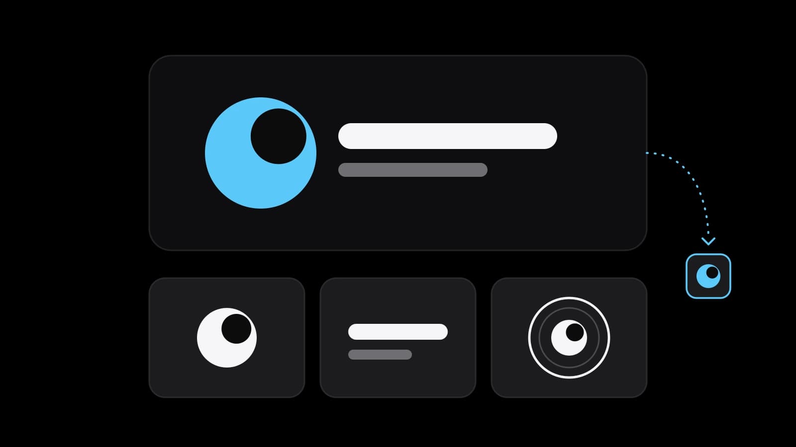
A business does not have to use every part everywhere. A tiny app icon or a social media avatar usually carries the sign alone, while a shop front or a letterhead carries the full lock-up. This is why a designer hands over several arrangements of the same logo rather than one picture. Each arrangement is the same identity, adapted to the space it has to fill.
Main types of logos and what each one suits
Wikipedia sorts logos into three classifications, which can be combined. Ideographs are completely abstract forms, and the article gives the Chase Bank logo as its example. Pictographs are iconic, representational designs: a bird, a tree, a cup. Logotypes, or wordmarks, depict the name or the company initials, which covers both a full name and a short monogram of two or three letters.
In everyday practice designers add two more labels. A combination mark joins a sign and a name, and it suits a young business whose name nobody knows yet, because the picture and the words teach each other. An emblem places the name inside a shape, like a badge or a seal; it looks solid and traditional but is the first to lose detail when it shrinks. A wordmark suits a short, distinctive name, while an abstract sign needs years of exposure before it means anything on its own.
Logo and trademark: related ideas, different things
A logo is a design, and a trademark is a legal status. WIPO, the World Intellectual Property Organization, defines a trademark as a sign capable of distinguishing the goods or services of one enterprise from those of other enterprises. Its page lists words, letters, numerals, drawings and symbols among such signs, along with shapes, packaging, sounds and colours. A logo is one of many things that can become a trademark, and it becomes one through a legal procedure rather than through design.
Russian law spells this out. Article 1477 of the Civil Code, as published by ConsultantPlus, describes a trademark as a designation that serves to individualise goods, with an exclusive right confirmed by a certificate. Article 1482 allows word, figurative, three-dimensional and other designations or their combinations, in any colour or combination of colours. Article 1491 grants the right for ten years from the filing date and allows renewals for further ten-year periods. The Russian-language Wikipedia adds that copyright in the drawing itself is protected independently of trademark rights.
Other countries organise this differently. The USPTO says that in the United States you become a trademark owner as soon as you start using the mark with your goods or services, but only in the area where you trade; registration is not required and gives nationwide rights. WIPO notes that protection is obtained through national or regional offices, or through the Madrid System, which offers one procedure for several territories. These rules change and depend on the case, so check yours with a patent attorney before the logo goes on anything expensive.
Where a logo ends and a brand identity begins
Wikipedia notes that a company logo is today often treated as a synonym for its trademark or brand, and then corrects the shortcut: the logo is the central element of a complex identification system. That system, usually called brand identity, also includes colours, typefaces, the style of photos, the layout of documents and the tone of the texts. The logo is the signature at the bottom of the letter. The identity is the handwriting of the whole letter.
The difference matters when you order. A logo answers one question: how people will recognise the name. An identity answers how everything else will look so that a price list, a website and a delivery box feel like the same company. A small business can start with the logo and a couple of colours and grow the rest later. The same article warns that frequent redesigns are counterproductive, because a logo stands for the brand, so the starting point deserves care.
A logo in vector and the files a business needs
When a printer or a sign maker asks for the logo in vector, they mean a file built from shapes rather than pixels. Wikipedia describes vector graphics as images created directly from geometric shapes, and uses the example of a vector logo that keeps the same crisp quality when enlarged to billboard size. A low-resolution raster image, by contrast, blurs or pixelates when it is enlarged. A JPEG saved from a website will not survive the trip to a shop front.
The same article lists the common vector formats: SVG, WMF, EPS, PDF, CDR and AI. In practice a business needs SVG for the website, PDF or EPS for print, and the source file from the designer's program for future edits. Next to them sit raster copies in PNG with a transparent background for presentations, messengers and social networks.
Each of these files should exist in several versions: the full colour logo, a one-colour version, a white version for dark backgrounds, and the sign on its own. Ask for a short guide that shows the minimum size and the clear space to keep around the logo. Store everything in one shared folder that does not depend on a single employee's laptop.
Testing a logo before launch: small, one colour, dark
Wikipedia observes that a logo is formatted and reformatted from large monitors to small handheld devices, and that designers have moved toward bold, simple shapes with heavy lines and solid colours. The article explains the reason: such marks cause less confusion among other logos in tight spaces and when scaled between media. That gives three tests any owner can run in ten minutes, without a designer.
First, shrink the logo to the size of a browser tab icon and a chat avatar and see whether it is still recognisable. Second, print it in one colour, black on white, as it would appear on a receipt or a rubber stamp; if it falls apart without gradients, it is not finished. Third, place it on a dark background and on a busy photo. Thin lines that vanish and letters that merge are far cheaper to fix now than after the first print run.
Preparing to order a logo or making one yourself
Before you order, write down the name exactly as it will be spelled, what the business does, who buys from it and where the logo will be seen most: a shop front, a package, a phone screen. Collect a few logos you like and a few you dislike, with a sentence on why. Check whether a similar name or sign is already registered in your category, and make the registration decision itself together with a specialist. With this sheet, a designer spends time on ideas rather than on guessing.
Doing it yourself works when the name is short and a clean wordmark in a good typeface is enough. It stops working when you need an original sign, a full set of vector files and a mark that can later be registered. At that point a studio such as VITON13 Studio can take the brief, and the guides below cover what a logo costs and how it differs from a full identity. Whichever path you choose, the question of what is a logo becomes a practical one: what should yours say at a glance.
Practical checklist
- Write the name exactly as it will be spelled and list the three places the logo will appear most often.
- Shrink the draft logo to browser-tab icon size and check that it is still recognisable.
- Print the logo in black on white, then place it on a dark photo to see which details disappear.
- Ask for SVG, PDF or EPS, transparent PNG and the source file, each in colour and one-colour versions.
- Before printing, ask a patent attorney whether a similar mark is already registered in your category.
Questions and answers
Is a company logo the same as a registered trademark?
No. A logo is a design, while a trademark is a legal status a sign receives through registration with a trademark office. In Russia the exclusive right is confirmed by a certificate; in the United States some rights arise from use, and registration extends them to the whole country.
What does it mean to have a logo in vector format?
It means a file made of geometric shapes rather than pixels, so the logo stays sharp on a business card and on a billboard alike. Common vector formats are SVG, EPS, PDF and AI; a PNG or JPEG is raster and turns blurry when it is enlarged.
Which type of logo suits a new small business best?
Often a combination mark: the sign and the name together, so customers learn both at once. A wordmark alone works for a short, distinctive name. An abstract sign without the name needs a long time and a lot of exposure before people connect it with the business behind it.
How long does trademark protection for a logo last?
Under Article 1491 of the Russian Civil Code, the exclusive right lasts ten years from the filing date and can be renewed ten years at a time. WIPO says the term varies between countries but is usually ten years. Rules change, so confirm the current terms for your country with a specialist.
Should a business redesign its logo every few years?
Not as a habit. Wikipedia points out that since a logo represents the brand, frequent redesign works against it: people lose the mark they had learned. A refresh makes sense when the logo fails real tests, such as small screens or one-colour printing, or when the business itself has changed.