
Answer in brief
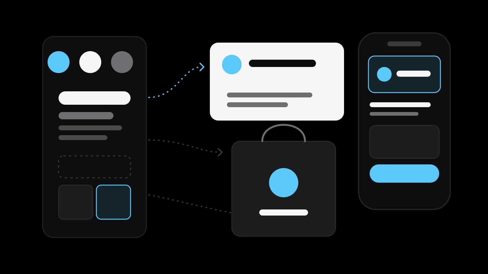
Corporate identity is the set of constant elements a company uses to present itself, such as its name, logo, colours, typefaces and graphics, together with the rules for combining them. It lives on every carrier, from the website to the invoice. The rules are written down in guidelines or a brand book; a small business can start with a minimal kit and one page of rules.
Corporate identity is a set of constants with rules
People who ask what is corporate identity usually expect a list of pictures: a logo, a colour, perhaps a font. Wikipedia describes corporate identity as the manner in which a company presents itself to the public, and notes that it is usually made visible through branding and trademarks. The Russian-language Wikipedia is more practical: it calls it a set of verbal and visual constants that make a company or a product read as one thing to the customer.
The key word is constants. A constant does not change from sign to post to invoice. A bakery that uses the same green, lettering and small drawing of wheat on bags, menu board and delivery app becomes recognisable before anyone reads the name. A bakery that changes all three every season has decorations, not an identity.
The second half of the answer is rules. Someone has to decide how large the logo may be on a receipt, which colour is background and which is accent, which font sets headings and which sets prices. Without those decisions every new designer, printer or employee guesses, and every guess drifts a little. Corporate identity is the elements plus the agreement on how to use them.
What a corporate identity kit usually contains
Wikipedia lists the core of a visual identity as the company name, a logo, which may be a logotype, a symbol or both, and supporting devices, all assembled within corporate guidelines. Those guidelines typically fix the approved colour palette, the typefaces and the page layouts. The wider article adds slogans, buildings, décor and uniforms; a small business needs far less, but the list shows how far the idea stretches.
Colour often does more work than the logo. Wikipedia calls corporate colours some of the most recognisable elements: red for Coca-Cola, blue for IBM, which earned the nickname Big Blue, and brown for UPS. The lesson for a small company: pick a palette you can repeat everywhere, from cheap print to a phone screen.
The Russian-language Wikipedia article describes the order in which the work is usually done. First a core idea is chosen, then the colour range and the fonts, and only after that the standards for placing the company symbols on things. Graphic elements belong here as well: a pattern, a shape borrowed from the logo, a style of icons or photographs. They keep a page recognisable even without the logo.
Where a corporate identity lives day to day
An identity is tested on carriers, not on a presentation slide. The Russian-language Wikipedia article lists the usual ones: letterheads, business cards and souvenirs, outdoor and television advertising, promotions and shelf displays, websites and banners, internal documents and even the office building. For a small business today it starts with the website, packaging, social profile and invoice.
Follow one logo through a week. On Monday it sits large in a website header, on Tuesday it shrinks to a round avatar in a messenger, on Wednesday it is printed in one colour on a paper bag. On Thursday it sits on a marketplace card among a hundred competitors; on Friday it is a small mark in a contract template. A good identity is designed with that week in mind, with versions for small sizes, for a single colour and for dark backgrounds.
Corporate identity, visual identity and brand identity compared
The vocabulary is messy. Wikipedia treats corporate identity broadly: besides the visual side it can include product design, advertising and public relations. Visual identity is the narrower, drawn part of it: the name, the logo, the colours, the type. In studio talk the two often mean the same files, so ask what a quote includes.
Brand identity is a third term, and it leans towards meaning: what the company stands for and what it wants people to feel. That question is answered before any drawing starts. A logo can express that meaning but cannot replace it. Corporate identity, as used here, is the practical layer that carries the meaning to a hundred different materials.
In Russian, the everyday term firmenny stil sits next to aidentika, borrowed from the English identity. The Russian-language Wikipedia article links the modern system of graphic forms in corporate identity to design of the 1950s to 1970s and the Swiss style. Many designers use aidentika for a living system grown from one idea and firmenny stil for the approved kit of elements, while others treat the two as synonyms. Neither usage is wrong; the scope written into the brief is what counts.
Brand book, design guidelines and the brand itself
Wikipedia says plainly that the guidelines govern how the identity is applied. In Russian practice the same document is called a brand book, a guideline or a set of design standards, and the Russian-language Wikipedia article even remarks that brand book is not quite the right word, since such a document may describe both the company brand and the brands of its products. The name matters less than what is inside: examples, sizes, colour codes and forbidden uses.
Good guidelines also say who may use what. The GOV.UK Design System, the public rulebook for British government services, gives a clear example. It states that a service on the service.gov.uk subdomain must use the GDS Transport typeface, while a public service on another subdomain should use an alternative typeface. One such sentence ends an argument that would return with every project.
The brand is something else: the reputation and the expectations that live in customers' heads. Wikipedia's example is Apple, where the same message across advertising, stores, employees and products builds what the article calls brand consonance and, through it, a strong corporate identity. An identity cannot create a reputation on its own, but a careless one can blur a good reputation.
The logo as a trademark and what the law protects
Part of an identity can also become property. Russia's Civil Code, in Article 1482, says that word, pictorial, three-dimensional and other designations, or combinations of them, may be registered as trademarks, and that a trademark may be registered in any colour or combination of colours. So a name and a logo can be protected by registration. That is a separate step, best planned alongside design rather than after the packaging is printed.
The United States Patent and Trademark Office describes a trademark in similar terms: any word, phrase, symbol, design or a combination of these that identifies your goods or services. Rules vary by country and change, so treat these quotes as a starting point. Before printing packaging in large runs or selling a franchise, check your own case with a patent attorney or a trademark lawyer.
Small kit or full system: when a business needs one
A small corporate identity is the minimum that keeps materials consistent: a logo in a few versions, a palette of two to four colours, one or two typefaces, a business card and letterhead, templates for social posts and a short page of rules. It suits a new company, one shop or a solo specialist. A full system adds graphic elements, photography and icon styles, templates for presentations and documents, packaging, signage, uniforms and a complete guidelines document.
The signs are usually visible on the desk. Materials made by different people look as if they belong to different companies. A new contractor asks for the logo and receives a blurred screenshot. The company opens a second location or launches on a marketplace next to competitors. In each case the cost of guessing grows with every new carrier.
An identity is also a decision that can be revisited. NASA's own archive describes its logotype nicknamed the Worm, developed under the Federal Design Improvement Program, which the President launched in 1972, and approved in October 1975 by the Commission of Fine Arts and the NASA Administrator. Its letters had strokes of one width, and the two letters A had no crossbars. It represented the agency from 1975 to 1992 and has since been retired. Even a celebrated system serves for a period, and it works because it is applied the same way throughout.
Preparing to order a corporate identity or build it yourself
Whether you hire a designer or work alone, start with one sheet of paper. Write down what the business does, for whom, and three words for how it should feel. Collect what already exists: logo files, colours, photographs, materials you like and dislike, and competitors you want to differ from. List the carriers you really have, from the website and the marketplace card to the invoice and the delivery van; the kit is built for them.
A small kit can be assembled alone if the business is simple and someone on the team has a good eye: a clean wordmark, a palette, two fonts with suitable licences, a few templates and one page of rules. It is worth ordering when the identity has to carry an idea, work across many carriers or be registered as a trademark, and when several people will produce materials from it. A studio such as VITON13 Studio can turn that sheet into a kit and guidelines; prices are on the linked pages. Once the question of what is corporate identity has been answered for your own business, the useful one becomes which constants it will repeat everywhere.
Practical checklist
- List every carrier the business really uses, from the website to the invoice and the delivery van.
- Gather the current logo files, colours, photos and examples of materials you like and dislike.
- Fix a palette and one or two typefaces, and check the font licences before using them.
- Write a one-page rule sheet: logo sizes, background colours and forbidden versions of the mark.
- Ask a trademark specialist whether the name and logo should be registered before large print runs.
Questions and answers
How is corporate identity different from a logo?
A logo is one element. A corporate identity adds the colours, typefaces, graphic elements and templates around the logo, and the rules for combining all of them on each carrier, so that materials made by different people still look related.
Does a small business need a full brand book for its identity?
Usually not at the start. A one-page rule sheet with logo versions, colour codes, fonts and a few examples is enough for one shop or one specialist. A complete guidelines document pays off when many people and many carriers are involved.
Is corporate identity the same as visual identity?
The terms are often used for the same set of files. Strictly speaking, visual identity is the drawn part: name, logo, colours and type. Corporate identity can be wider and cover how the company presents itself through products, advertising and public relations.
Can a corporate identity be protected by trademark law?
Parts of it can. In Russia the Civil Code allows word, pictorial, three-dimensional and combined designations to be registered as trademarks, in any colour. Rules depend on the country and change, so discuss your own case with a patent attorney.
How often should a company change its corporate identity?
There is no fixed term. An identity is changed when the business changes, not when fashion does. NASA used its Worm logotype from 1975 to 1992, and in those years it worked through consistent use rather than novelty.