
Answer in brief
Brand identity is the set of constant signs, visual and verbal, that a company uses everywhere it appears: a mark, colours, typefaces, a graphic device, a style of images and a tone of voice. The logo is one of those signs, the brand is what people think of the company, and the brand book is the instruction for using the set. Its value lies in consistency: the same signs, used the same way, are what people learn to recognise.
Brand identity is what people recognise before they read the name
People who type what is brand identity into a search box usually expect a synonym for logo. The answer is wider: it is the set of signs by which a company is recognised before anyone reads its name. Wikipedia, in its article on corporate identity, calls it the manner in which a corporation, firm or business enterprise presents itself to the public. The Russian-language Wikipedia puts it more drily: a set of verbal and visual constants. Constants is the useful word, because these signs stay the same wherever the company appears.
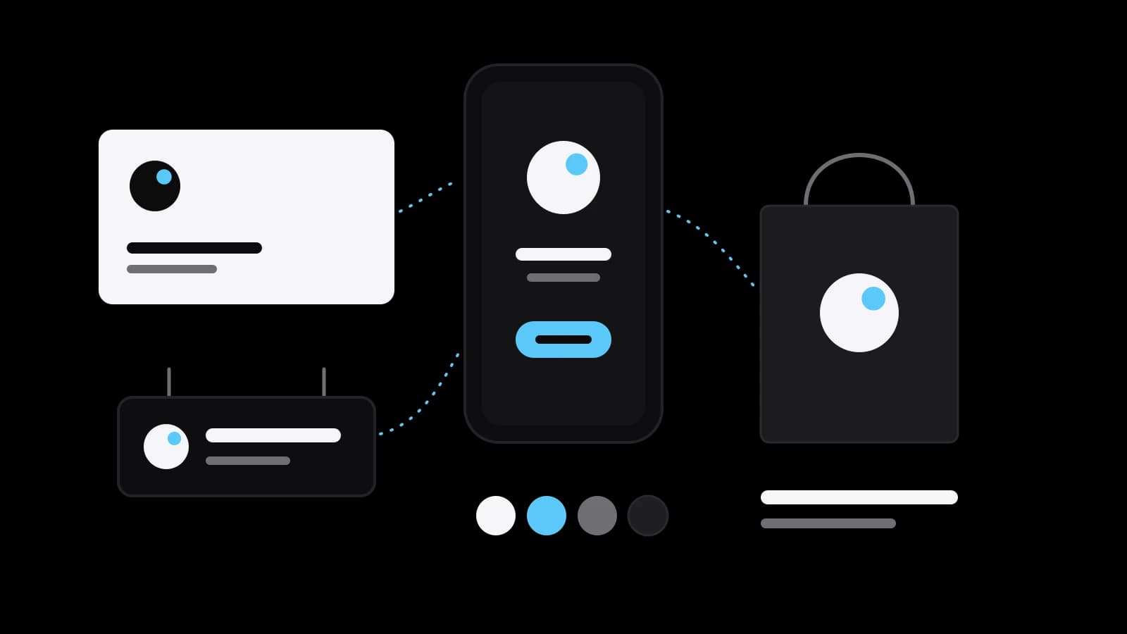
The everyday test takes a second. You notice a certain red on a shelf and think of Coca-Cola before the lettering comes into focus; Wikipedia gives that pairing among its examples of corporate colours, next to the blue of IBM and the brown of UPS. Each company used one colour, in one way, for so long that it began to work as a name. A small business plays the same game on a smaller field: the bag a customer carries out, the avatar in a messenger, the sign over the door.
Identity, logo, brand and brand book: four words for four different things
The four words are used as one, and many disappointments with designers start there. A brand, in Wikipedia’s definition, is a name, term, design, symbol or any other feature that distinguishes one seller’s goods or service from those of other sellers. A logo is one sign: the visual trademark that identifies a brand, in the wording of the same article. An identity is the whole family that sign belongs to: a collection of components such as a name, a design, a set of images, a slogan, a writing style, a particular font or a symbol. A company with a logo and nothing else has a signature but no handwriting.
A brand book is the document where the family rules are written down. Wikipedia notes that a corporate identity is commonly assembled within a set of guidelines, which usually include approved colour palettes, typefaces and page layouts; the Russian-language Wikipedia adds that the manual goes by several names: brand book, guideline, design standards. One more pair is worth keeping apart. Brand identity is assembled by the owner and shows how the owner wants to be seen, while brand image is the picture that actually forms in a customer’s head. You can commission the first; the second you can only earn.
What an identity is made of, shown on one published project
Components are easier to follow on a real job. Pentagram, a design studio that publishes its projects, describes the identity it made for Impala, a travel platform that connects hotels with customers. The mark combines a compass and the impala antelope. The primary typeface, Impala Supply, was adapted by Pangram Pangram from its own Supply typeface. The palette is based on the colours of sand, sunset and sea. The graphic devices are pairs of coloured vertical bars taken from the language of tickets and a coloured barcode that emphasises words on posters.
The same page lists what a client rarely thinks to ask for: icons in three styles, typographic tags and buttons, and a friendly tone of voice. The voice is identity too; Wikipedia counts writing style among the components. So is motion: Google’s design team describes the animated dots of its logo as a state for interactive, assistive and transitional moments, when the product is listening, thinking or replying. That is the full alphabet, and a small company writes with fewer of its letters.
Where an identity lives: the website, the packaging, the sign, the uniform
Everything a customer can see or hold is a carrier. Wikipedia’s list for corporate identity runs from the company name, logo and slogan to buildings, décor, uniforms and company colours. For a small business it is more practical: the website, the profile picture on social networks, the packaging, the sign, the price list, the courier’s jacket. Spotify’s guidelines cover both worlds: the minimum size of its logo is given twice, 70 pixels for screens and 20 millimetres for print.
Wikipedia also names four jobs that a visual identity does, and only the first is obvious. It makes the organisation visible and recognisable. It stands for the organisation in the eyes of outsiders and so feeds its reputation. It shows structure, that is, how the parts of a company relate to one another. And it helps employees identify with the place where they work, which is why a uniform and a tidy document template are not vanity.
Why consistency is the whole point: Spotify’s rules for its own logo
Spotify publishes design and branding guidelines for outside developers who build its service into their products, and they read like a short course in consistency. At the time of writing, the green logo may be used only on a black or white background; any other background calls for a monochrome version. Around the logo there is an exclusion zone equal to half the height of the icon. The wordmark never appears without the icon. Orientation, colour and composition stay as shown, and the document adds that there are no exceptions.
The strictness has a plain reason. A sign seen a hundred times in one form is learned, while a sign seen in a hundred forms is a hundred different signs. Google’s design team names the aim of its own system as consistency in people’s daily encounters with Google. Consistency is not monotony: Spotify forbids new colours outside its palette, yet invites surprising combinations inside it. And identity has a limit: it makes a business easier to recognise, but does not repair a weak product or a slow reply.
How an identity is developed: study, idea, system, rules
The work has an order. The Design Council, the UK’s national strategic advisor for design, traces the origins of its Double Diamond to 2003 and describes it as a visual representation of the design and innovation process with four phases: discover, define, develop, deliver. The first half helps people understand, rather than simply assume, what the problem is. For an identity that means studying who buys, what competitors look like and where the company will be seen. The second half produces several answers, tests them at small scale and rejects those that will not work.
Google’s account of its own redesign shows the same order at full size. Designers from across the company met in New York for a week-long sprint and left with a brief of four tasks: a mark that scales to constrained spaces, motion that responds to the user, a systematic approach to branding across products, and a sharper sense of what makes the company itself. They reduced the brand to four colours on a white background and rebuilt it from there. Only then came the rules: standards for spacing, clearance and product lockups.
When an identity needs replacing and when a refresh is enough
A good reason to change an identity is a change in where people meet the company, not boredom with the old sign. Google’s official blog explained its 2015 update with one sentence about the past: once, Google was one destination reached from one device, a desktop PC. By then people were using it through a constellation of devices, as the design team put it. Yet the new logo, a geometric sans-serif in place of the old serifs, kept the multi-coloured playfulness and the tilted letter e of the previous one.
A simple fork follows. A full change is worth discussing when the business itself has changed: a new audience, a new product, a merger, or a medium in which the present sign cannot be read. A refresh is enough when customers recognise the company and the trouble is technical: the logo exists only as a small picture, the colour differs between the website and the print shop, every contractor picks a typeface of their own. Then the existing signs are redrawn cleanly, given exact values and written into rules.
The minimum identity for a small business and what to prepare before ordering
A small company does not need Spotify’s rulebook. It needs a set small enough to be used every day: a mark in a full and a compact version, as Google keeps a separate G for small contexts; two or three colours with exact codes; one or two typefaces; a page of rules. Doing this yourself is reasonable when there is one sales channel and nobody but you produces the materials. Ordering makes sense when the identity has to live on packaging, a sign and a website at once, or when employees and contractors make things without you in the room.
Before you talk to a designer, put a few answers on one sheet. Who buys from you and what they compare you with. Where the identity will appear during the next year, as a plain list. What customers already recognise, because that is kept, not thrown out. Three examples you like and three you do not, each with a reason. With that sheet a studio such as VITON13 Studio can name the scope precisely, and the question of what is brand identity gives way to a more useful one: what should people recognise us by.
Practical checklist
- List where customers see your company in a normal week: site, social profiles, packaging, sign, documents.
- Gather every version of your logo and colours now in use and mark the ones that disagree with each other.
- Decide what customers already recognise you by and keep it off the list of things to change.
- Pick three identities you like and three you do not, and note the reason for each in one line.
- Name one person who approves the result and one folder where the final files and rules will live.
Questions and answers
Is brand identity the same thing as a logo?
No. A logo is a single sign, while brand identity is the whole set it belongs to: colours, typefaces, a graphic device, a style of images and a tone of voice. A logo used without the rest looks different every time it is placed next to new colours and fonts.
What is the difference between brand identity and brand image?
Wikipedia draws the line this way: identity is assembled by the owner and expresses how the owner wants the brand to be perceived, while image is the mental picture a customer actually has. A designer can make the first. The second depends on the product and the service as well.
Does tone of voice belong to brand identity or only the visuals?
It belongs. Wikipedia lists writing style among the components of brand identity, and Pentagram names a friendly tone of voice next to the visual identity in its Impala project. If the pictures are calm and the texts shout, people notice the mismatch even when they cannot name it.
Can a company change its brand identity without losing recognition?
It can if it carries over what people remember. When Google redrew its logo in 2015, the serif letters gave way to a geometric sans-serif, but the playful colours and the tilted letter e stayed. Decide first which signs customers already know, then change the rest.
Does a small business need a brand book for its identity?
It needs written rules, not necessarily a thick book. A page or two with the versions of the mark, the colour codes, the typefaces and examples of right and wrong use is enough for a start, as long as everyone who makes materials actually has it.