
Answer in brief
A brand book is a document that records how a company looks and speaks, so that anyone who makes its materials gets the same result. It has two halves: the meaning (audience, promise, character, voice) and the look (logo, colours, type, layouts). A small company can start with a one-page sheet and grow it into a guideline or a full book when contractors, partners or new employees begin to produce things in its name.
A brand book is a manual for how a company looks and speaks
A founder usually asks what is a brand book at an awkward moment: the logo is finished, the printer wants exact colours, and a freelancer has just stretched the sign to fit a banner. The short answer is a written agreement with yourself. Unisender, an email service with its own guide to the subject, defines a brand book as a document in which everything that concerns the brand is written down. Wikipedia describes the visual core in its article on corporate identity: a name, a logo and supporting devices, assembled within guidelines that govern how the identity is applied.
A plain picture helps. Think of the recipe card in a café kitchen: the chef knows the dish by heart, but the card exists for the cook who starts on Monday. A brand book does that job for the face and the voice of a company. It lets a person who has never met the founder make a sign, a post or a price list that looks and sounds like the same business.
Two halves of the book: what the brand means and how it looks
The first half is about meaning. Unisender lists what usually goes there: the brand name with its permitted spellings, the positioning, the unique selling proposition, the target audience and the character of the brand. Large, detailed books add a mission, values, a slogan and a tone of voice. This half tells a copywriter whom the company is talking to and what it promises, before a single colour is chosen.
Voice is the hardest part to picture on paper, so read one that is public. Mailchimp keeps its content style guide online and separates two things in it. “You have the same voice all the time, but your tone changes,” the guide says, and then pins the voice down in four short statements: plainspoken, genuine, “translators”, and dry in humour. A new writer can hold a draft against that list.
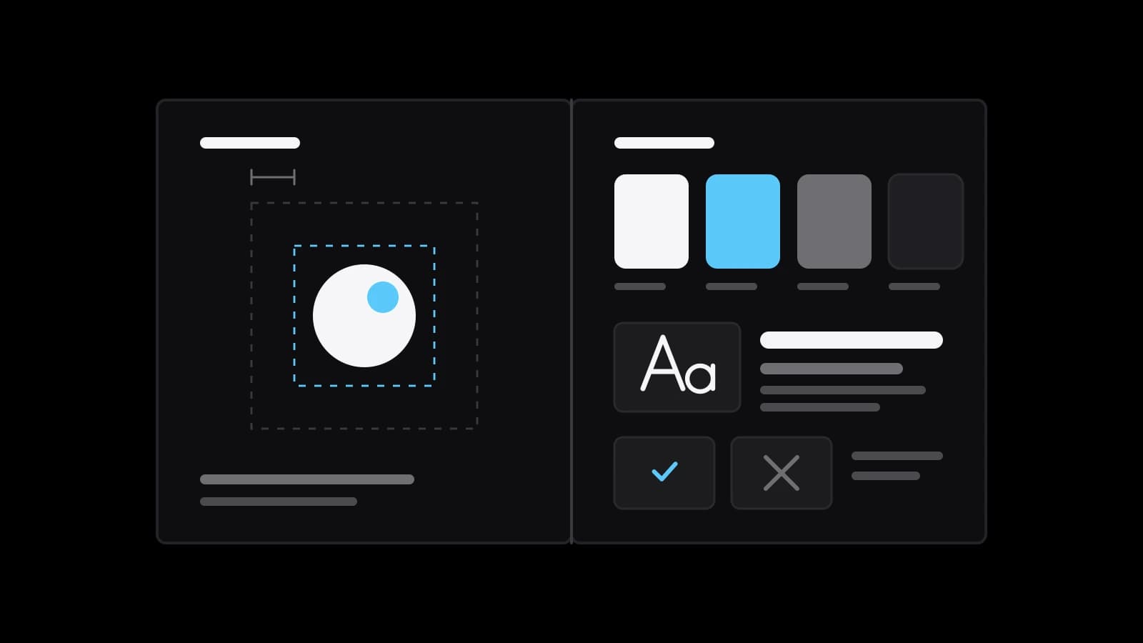
The second half is the look. Wikipedia’s list is short: such guidelines usually include approved colour palettes, typefaces and page layouts. GitHub’s public Brand Toolkit shows how far this goes. Its Foundations section holds colour, logo, typography and accessibility; another lists graphic elements from iconography to illustration; “Brand in action” covers presentations, social media and swag. Next to them sits “Brand identity”, with brand attributes and voice and tone, so both halves live under one roof.
Brand book, guidelines, logo book: three sizes of one document
The words overlap, and sellers use them loosely. In Unisender’s reading the brand book is the general document about the brand, and the guideline is an integral part of it: the rules for using the elements of the visual identity. A shortened guideline that describes only the logo is called a logo book. So the three names stand for three volumes of one thing, from a few pages about a single sign to a full description of the brand.
English-language studios draw the same ladder with other labels: the brand book says why the company exists, the brand guidelines inside it say how to express that through rules for visuals and voice, and the style guide goes down to specifics such as hex codes, grammar and measurements. Neither scheme is a standard. Unisender warns that some agencies say “brand book” when they mean a guideline, and advises always asking what the service includes. Compare tables of contents, not titles.
Who actually opens it: the designer, the printer, the new hire
A brand book is written for people who were not in the room when the brand was made. The designer opens it to find the right version of the logo and the space to keep around it. The printer needs colour values for ink, not a screenshot from a phone. The marketer checks how the name is spelled and which words the company avoids. A new employee reads it in the first week and stops guessing.
For a small company the list is shorter but just as real. It is the freelancer who makes the social media templates, the sign maker, the designer of the marketplace cards, the partner who opens a second outlet under your name. A franchise or a dealer network multiplies the problem, because the people producing your materials do not even work for you. If nobody except the owner ever makes anything, there is nobody to read the book yet.
Inside three public rulebooks: NASA, Spotify and Yandex
NASA publishes its brand guidelines on its own website, and they read like regulations for a reason: the page says the standards are issued under the authority of 14 CFR 1221, a part of the US Code of Federal Regulations. It explains the round insignia element by element: the sphere represents a planet, the stars space, the vector aeronautics and the orbit space travel. It names typefaces: Helvetica and Garamond for print, Inter, Public Sans and DM Mono for the web. It measures the protected space around the sign in units it calls N, and states that the seal and the insignia should never be used together.
Spotify’s document is “meant to help any external developer integrating Spotify into their product”, and it is full of numbers. The logo should never be smaller than 70 pixels on screen or 20 millimetres in print; for the icon alone the limits are 21 pixels and 6 millimetres. The exclusion zone around it equals half the height of the icon. There are layout numbers too: leave room for 25 characters of a playlist or album name, 18 of an artist name and 23 of a track name.
Yandex shows the opposite extreme: its rules for non-commercial use of the logo fit into seven numbered points on one page. Anyone may place the logo on their website or in a mobile app if they follow the rules, and any other use needs written permission. Its appearance, proportions and colours may not be changed, and it may not suggest a partnership with the company. These are the pages as they read when this story was written; Yandex states that it may change its rules, so check the current text before you rely on a number.
When one page of rules is enough for a small company
A full book is not a rite of passage. Unisender names the one case where a brand book is not needed at all: an MVP, a product that is still being tested. Once the brand starts to gather an audience, it calls a guideline the minimum starter pack for consistent communication, and suggests adding the other sections when the business earns steadily. It adds that some companies manage with a few lines: the use of the document is defined not by volume but by how informative it is.
So a company of five people with one designer can live honestly on one page. That page holds the logo files, the colours with codes for screen and print, one or two typefaces, the spelling of the name and three examples of what not to do. Yandex’s seven points show that even a very large company can state its public logo rules on a single screen. There is one more reason for restraint: a book nobody has time to read protects nothing.
How to tell a working brand book from a decorative one
The first sign is that a rule can be checked. “Never smaller than 70 pixels” can be measured; “use the logo with respect” cannot. The same holds for words: “be bold and modern” means something different to every reader, while “write to one person, no exclamation marks” is something an editor can verify. Ask of every page whether two different contractors would produce the same result from it; where they would not, the page is decoration.
The second sign is that the book shows mistakes and not only ideals. Spotify lists what not to do with its logo: do not rotate it, stretch it, fill its lines or use it as a letter in a sentence. NASA admits that its own list of violations is not comprehensive and is subject to changes and additions. The third sign follows from that: a working book has an owner and an address where the current version lives, as the Yandex rules do. A decorative one is a handsome file nobody has opened since it was presented.
What to prepare before you order a brand book
Start with what already exists. Gather the logo in its source files, the colours and fonts you really use, and ten recent materials: a post, a price list, a sign, a package, a presentation. Mark the ones that feel right and the ones that do not. Then write down who makes materials for you today and who will be making them in a year. That list decides the size of the document more than any fashion does.
Next, choose the volume. If the logo is settled and other people already produce things in your name, a guideline is the natural order. If the name, the audience or the promise are still moving, settle those first, because a book records decisions and does not make them. A one-page sheet you can assemble yourself in an evening; the larger work is worth ordering when a contractor’s mistake costs more than the document does. VITON13 Studio does identity and guideline work, and its guide, linked below, explains what each volume includes. Ask for the contents list first, and the answer to what is a brand book will lie on one sheet in front of you.
Practical checklist
- Count the people who make materials for the company today, and those who will in a year.
- Put the logo sources, the colour codes and the font names in one folder before you talk to a contractor.
- Write the brand name the one way it must be spelled, and the ways it must never be spelled.
- Ask every bidder for the table of contents of the document, not for the word they use for it.
- Test each rule in a draft: could two different contractors follow it and arrive at the same result?
Questions and answers
Is a brand book the same as brand guidelines?
Not always. In the scheme most studios use, the guidelines are the part with the visual and verbal rules, and the brand book adds the meaning: positioning, audience, character. Some sellers use both words for one thing, so ask what the document will contain.
Does a small business need a brand book from the first day?
Usually a short sheet is enough at the start: logo versions, colour codes, fonts, the spelling of the name and a few examples of misuse. Unisender’s guide treats a guideline as the minimum once the brand gathers an audience, and the wider sections as a later step.
How long should a small company’s brand book be?
There is no required length. Yandex states its public logo rules in seven points, while the NASA guidelines run through the insignia, the logotype, typography and supporting elements. The length should follow the number of people and media the rules have to serve.
Why do large companies publish their brand rules openly?
Because the readers are outside the company. Spotify addresses external developers, Yandex addresses owners of websites and apps, and Mailchimp says its content style guide is completely public. An open page is also easier to keep current than a file sent by email.
Can I put together a brand book without a designer?
The one-page version, yes, if the logo and the colours already exist: collect the files and write the rules down. The parts that need design decisions, such as a logo system, a type scale or layouts for many media, are where it makes sense to involve a specialist.