
Answer in brief
UX design decides how a product works for the person using it: what they need, which steps they take, where they get stuck. UI design gives those steps a visible form: screens, buttons, text, colours and states. A business gets a tested structure, a prototype and a set of screens and components that developers can build from, and fewer visitors who leave because something was unclear.
UX is how the order form works, UI is how it looks
Take the order form of a small online shop. Someone has to decide which fields it asks for, what happens when the phone number is mistyped, and what the buyer sees after pressing the button. Someone also has to decide how the fields, the button and the error message look, so that it is obvious where to press. The first set of decisions is UX, user experience. The second is UI, user interface. UX/UI design is the name of the work that covers both.
Nielsen Norman Group’s definition, signed by Don Norman and Jakob Nielsen, is broad: user experience encompasses all aspects of the end user’s interaction with the company, its services and its products. The ISO 9241-210 standard, as Wikipedia quotes it, is drier: a user’s perceptions and responses that result from the use or anticipated use of a system, product or service. Both speak about a person, not about a screen. Norman and Nielsen add an example: a film review site with a perfect interface still gives a poor experience if its database lacks the small independent release someone came for.
What a UX designer hands over: research, flows, wireframes and a prototype
A UX designer’s output is mostly not pictures. The Interaction Design Foundation lists the typical tasks: user research, creating personas, designing wireframes and interactive prototypes, and testing designs. After research comes the route, which Nielsen Norman Group calls a user flow: the steps needed to accomplish a common task with a product. For the shop it is the path from the product card to the paid order, with its branches: the item is out of stock, the card is declined.
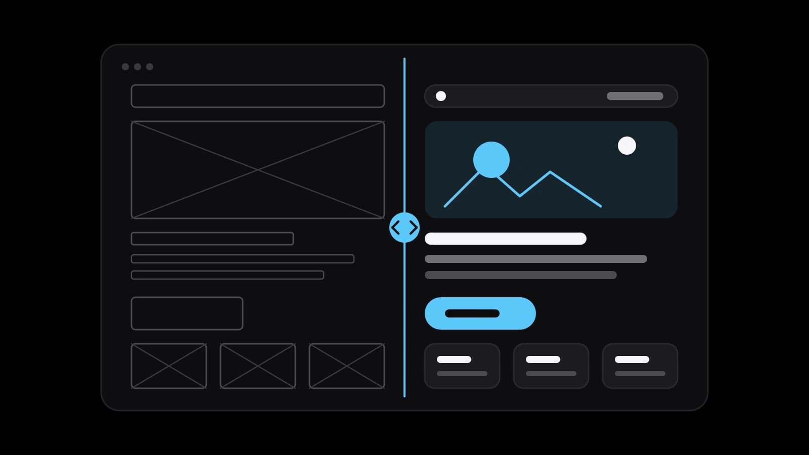
The structure of each screen is fixed in wireframes. The Interaction Design Foundation calls them basic visual representations of an interface that outline structure and layout, without colours, fonts or imagery; a mockup adds the visuals but stays static, and a prototype simulates interaction. The prototype is the part to ask for and click through personally. Nielsen Norman Group gives the reason in one line: ripping up code is very expensive, ripping up a prototype is not.
What a UI designer hands over: a visual language, components and their states
The UI designer takes the tested structure and gives it a face. The Interaction Design Foundation describes UI design as building interfaces with a focus on looks or style: colours, typography, buttons, icons. The work starts with a visual language, a small set of decisions that repeats on every screen: the typefaces, the meaning of each colour, the look of a primary button. A visitor could not name these decisions, but notices at once when two pages of one site look as if two companies made them.
On larger projects these decisions are gathered into a design system. Nielsen Norman Group defines it as a complete set of standards intended to manage design at scale using reusable components and patterns. Each component is described with its states, so a field exists empty, focused, filled, wrong and disabled, not as one pretty picture. The same article is frank about the cost: a design system is time-intensive to maintain and requires a dedicated team. A five-page site needs a tidy component kit, not a system.
The stages of design work, from the brief to the developer handoff
There is no single official process, and the Interaction Design Foundation says so directly. Most teams follow a variation of the five steps of design thinking: empathise through user research, define the problem, ideate, prototype, and test with real users. For a client this becomes a chain of deliverables: research, then flows and wireframes, then a clickable prototype, then the visual design. On testing, Jakob Nielsen’s article about test size argues that the best results come from testing no more than five users and running as many small tests as you can afford.
The handoff is the moment design becomes a specification. According to Nielsen Norman Group’s guidance on design specs, the design file should define the interaction flows, the visual styles, the grid and breakpoints, the components, real content instead of placeholder text, and accessibility needs such as tab order or alternative text. The same guidance asks to involve developers well before the design is finished. A design they first see on handoff day tends to come back as a list of things that cannot be built.
Telling a good interface from a bad one: Nielsen’s ten usability heuristics
A business owner does not need taste to review an interface. Jakob Nielsen published ten usability heuristics in 1994, and Nielsen Norman Group still publishes them as broad rules of thumb, not specific usability guidelines. Visibility of system status: the design should always keep people informed about what is going on, so after the button is pressed the form shows that the order is being sent and then accepted. User control and freedom: people often act by mistake and need a clearly marked emergency exit, a way to go back a step or cancel without starting again.
Error prevention: the best designs keep problems from occurring in the first place, and the form stops an impossible phone number before submission. Recognition rather than recall: a person should not have to remember information from one part of the interface to another, so the delivery address chosen on the first step stays in view on the last. Error messages, by the ninth heuristic, use plain language without error codes, indicate the problem precisely and suggest a solution. An interface that fails these questions is broken, however elegant it looks.
Accessibility in numbers: contrast, text size and tap targets in WCAG
Part of quality is written down as measurable criteria. The W3C publishes the Web Content Accessibility Guidelines; the WCAG 2.2 version on its site is a W3C Recommendation dated 12 December 2024. At its level AA, text must have a contrast ratio of at least 4.5:1 against its background, and large text at least 3:1. Large means at least 18 point, or 14 point bold, which the W3C’s explanatory page puts at roughly 24 and 18.5 CSS pixels. Text must also be resizable up to 200 percent without loss of content or functionality.
Several criteria apply directly to forms. Colour must not be the only visual means of conveying information: a field marked as wrong by a red border alone does not pass, and the error has to be described in text. Targets pressed with a finger or a mouse should measure at least 24 by 24 CSS pixels, with listed exceptions. The standard is revised from time to time. Whether a law obliges your site to meet it depends on the country and the kind of business, and that is a question for a lawyer.
When a business needs UX and UI work, and when design will not help
Three situations call for it. The first is a new product, site or app: decisions about structure are cheapest before anything is built. The second is a redesign: Nielsen Norman Group’s introduction to usability advises testing the old design first, to learn what is worth keeping. The third is the most common: visitors come and do not become customers. The same introduction is blunt: if a website is difficult to use, people leave, and the first law of ecommerce is that if users cannot find the product, they cannot buy it either.
Design also has a limit, the one from the film site example. If the offer is weak, the price is hidden or the catalogue lacks what people look for, a better interface only makes that visible sooner. Research can uncover such problems, but fixing them is a business decision. The honest test is whether a mistake in structure would cost more than the work that prevents it.
What to prepare before you order interface design
Start with the tasks, not with references. Write down the three or four things a visitor must be able to do: find a product, compare, order, return. Collect what you already know: analytics, the questions customers ask support, the steps where orders are abandoned. Prepare real texts and photos, because a design drawn on placeholder text breaks when the real names run to three lines. Agree in advance what you receive at the end: a clickable prototype, screens for phone and desktop, a component kit with states.
Doing it yourself or ordering it depends on what is at stake. A simple site on a website builder with a proven template already carries many sound decisions, and the ten heuristics plus a contrast check take an owner a long way. An app, a catalogue with filters, a customer account or an order in several steps is another matter: the structure is your own, and nobody has tested it for you. That is where UX/UI design is usually ordered, from a freelancer or from a studio such as VITON13 Studio; the linked guide explains what the cost is made of. Either way, ask for a clickable prototype before anyone writes code.
Practical checklist
- List the three or four tasks a visitor must complete, in the visitor’s own words.
- Collect analytics, support questions and the steps where people abandon an order.
- Prepare real texts, product data and photos before the first layout is drawn.
- Ask for a clickable prototype and try it on five people who resemble your buyers.
- Check text contrast and button size against the level AA criteria of WCAG 2.2.
Questions and answers
Is UX/UI design one profession or two?
Two sets of skills that one person often combines on small projects. UX covers research, structure and testing; UI covers the visual layer and the components. On a large product the roles are usually split, and it is worth asking who is responsible for which part.
Can a site look good and still have poor UX?
Yes. Nielsen Norman Group’s example is a film review site with a flawless search and a database that lacks the film the visitor wants. Looks are the interface; the experience also depends on whether the person gets what they came for.
How do a wireframe, a mockup and a prototype differ?
As the Interaction Design Foundation explains it, a wireframe is the blueprint: structure and layout without colours or images. A mockup shows the final look but stays static. A prototype simulates interaction, so you can click through it as if it were the product.
Does a small business need usability testing?
A small test is within reach of any business. Jakob Nielsen’s article puts the share of usability problems found by a first study with five participants at 85%, and recommends several small rounds over one large one. Watching five people try to place an order takes an evening and a prototype.
Does my website have to comply with WCAG?
WCAG is a technical standard published by the W3C. Whether a law obliges your site to meet it depends on your country and your type of business, so check your own case with a lawyer. As a design benchmark, the AA criteria for contrast and text resizing are a reasonable floor for any site.