
Answer in brief
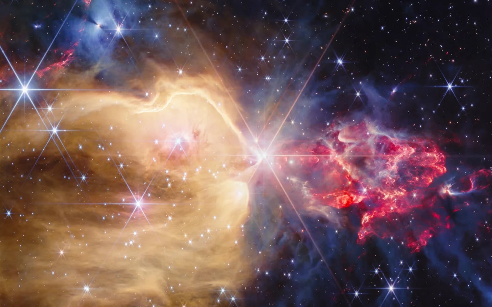
The NGC 7129 image released on 6 October shows gas, dust, stars and protostellar outflows. Visible colours are assigned to infrared filters, while the recurring spikes around bright stars come from the telescope's optics.
What was released on 6 October
NASA and ESA/Webb published a new view of the star-forming region NGC 7129, about 3,300 light-years from Earth. NIRCam reveals stars and protostars among gas and dust. This article's cover uses the actual observation, rather than an imagined space scene. Its source and complete credit appear with the image.
Release and exposure dates are different. NASA's asset record dates the data to 17 December 2025. Scientific images are prepared between observation and public release. That is a normal part of telescope work: the task is to present measurements accurately, rather than immediately send out an attractive picture.
Why one side is golden and the other red
The asset description associates the golden region with hot atomic hydrogen, and the region to the right with cooler molecular gas. Forming stars eject matter that interacts with their surroundings. Red areas and uneven textures make that activity visible. The coldest, densest regions appear grey in the presentation.
Read those colours with their legend. NIRCam records infrared light through several filters, and visible hues are assigned to the data. Red cannot simply be treated as the colour a human observer would see. As on a weather map, colour helps us distinguish measurements, but the display method determines what it means.
Why a growing star sends material outward
Star formation is not a quiet process of enlarging a glowing sphere. A protostar gains matter while some material leaves in directed outflows. NASA's description links these flows to structures in NGC 7129's gas. The picture shows objects at different stages of development sharing the same environment, rather than one uniform collection of stars.
Our editorial reading is that this unevenness makes the frame compelling: more mature stars, active protostars and dense regions without stars coexist. A single colour image still cannot reconstruct each object's complete history. Quantitative explanations require observations, models and further measurements, beyond a visual impression of activity.
The spikes around stars are not stellar jets
Bright points show Webb's characteristic diffraction pattern, produced by its optical system. Those recurring spikes should not be confused with outflows from protostars. Compare similar patterns around different bright stars with the irregular extended structures in the gas. A repeated shape around point sources points to the instrument rather than identical physical jets everywhere.
An image can therefore be based entirely on genuine observations while showing properties of the telescope and processing. Real does not mean identical to unaided human vision. Scientific honesty means explaining the method. Processing is necessary to show wavelengths our eyes cannot see; hiding that method would make the picture harder to interpret.
Turn the picture into a set of questions
Start with the large regions, then locate the bright central star, red outflows and grey clouds. Open NASA's asset record for distance, filters, observation date and colour assignments. This turns an image into questions about where the gas lies, what heats it and which objects were hidden by dust.
NASA and ESA/Webb also offer a view of the same region from Spitzer. Compare instruments and processing, rather than colour saturation alone. VJOURNAL's IceCube explainer provides another perspective: modern astronomy collects information in particles as well as light, and becomes stronger when those different measurements can be compared.
Questions and answers
Is this an AI-generated image?
No. It represents real Webb telescope observations. Visible colours have been assigned to infrared filters, rather than generated as an imagined scene.
Why were the data collected before publication?
Observations are processed and prepared for scientific and public presentation. NASA dates the data used here to 17 December 2025.