
Answer in brief
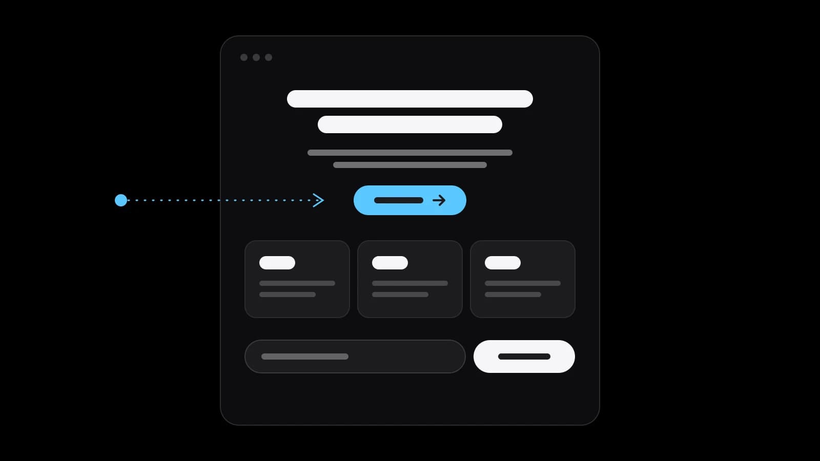
A landing page is a standalone page made for one campaign and one action. Visitors arrive from an ad, an email or a search result and see one offer and one button, without the menu of a full website. It suits one product, one offer or a test of demand; a business with many services or many search queries needs a website as well.
A landing page is one page with one job
People ask what is a landing page as if it were a kind of website. It is closer to a kind of conversation. Unbounce, which builds these pages for a living, defines it as a standalone web page created specifically for a marketing campaign: the place a visitor lands after clicking an ad, an email or another link. Wikipedia adds the purpose in plain words: the page exists to turn the people who arrive into buyers or prospects.
Everything else follows from that. The page does not introduce the company, list every service or tell the history of the brand. It continues one promise the visitor has just read somewhere else and asks for one action in return: leave a request, buy, book, subscribe. If the page tries to do a second job, it stops being a landing page and becomes a small, confused website.
How it differs from a website and from a homepage
A homepage is a lobby. It has a menu, a dozen doors and a visitor who has not decided where to go. Unbounce puts the difference bluntly: a homepage has tons of links, while a landing page centres on one goal and one call to action, with few or no clickable options that could pull the visitor away. That is why a good one often has no menu at all.
A website answers many questions for many kinds of visitors: what you sell, what it costs, who you are, how to reach you, what you wrote last month. Each of those is a separate page with its own heading, and each can be found in search under its own query. A landing page answers one question for one kind of visitor, and it is judged by one number: how many of them did the thing.
The two are not rivals. A company with a website still builds separate pages for a campaign, a seasonal offer or a new product, because sending paid traffic to a lobby wastes it. And a company that starts with one page usually grows into a website once it has more than one thing to say. The order depends on the business, not on fashion.
Two types: collect a request or lead to a purchase
Unbounce names two main types. A lead generation page uses a form to collect contact details: a name, a phone, an email in exchange for a quote, a consultation or a useful file. A clickthrough page has no form; it warms the visitor up and sends them on with a single button to a purchase or a sign-up. Services usually need the first, shops and subscriptions the second.
Wikipedia draws the line a little differently, between reference pages, which present information relevant to the visitor, and transactional pages, which ask the visitor to complete a form or a transaction. The labels vary, the choice does not: before a single block is drawn, decide whether the page ends in a conversation with you or in a payment without you. Everything on the page is then written towards that ending.
The blocks a working page is assembled from
The first screen carries the whole offer: what this is, who it is for, what it gives, and the button. A visitor who reads only that screen should already know whether to stay. Under it comes proof, because a claim without evidence is decoration: real work, real numbers, reviews with names, the conditions in writing. Then a short explanation of how it happens, step by step, so the action does not feel like a leap.
Then the price, or at least what the price depends on, since hiding it only moves the question to a call nobody wants to make. Then the objections, answered honestly as questions. And the same single action again, at the point where a convinced reader would otherwise have to scroll back. The length is whatever it takes to answer the doubts of this audience; a cheap impulse offer needs a screen, an expensive service needs a page.
Ad systems grade the page, not only the ad
Advertisers tend to polish the ad and forget where it leads. Google Ads does not. Its help pages describe Quality Score as a diagnostic made of three components: expected clickthrough rate, ad relevance and landing page experience, which Google defines as how relevant and useful your landing page is to people who click your ad. The page is one third of how the system sees the campaign.
In practice this is a rule of matching. The heading on the page should repeat the promise of the ad in the same words, the offer should be the one that was advertised, and the visitor should not have to search for it. A page that opens with something else is read as a mistake, by people first and by the ad system after them. Fixing the page is often cheaper than raising the bid.
When one page is enough, and when you need a website
One page is enough when there is one thing to sell and one way to buy it: a single service, an event, a course, a pre-order, a product you want to test before investing in a shop. It is also the right tool for a campaign with a start and an end, and for checking demand: a page and a small ad budget answer the question faster than a quarter of planning.
It stops being enough when the business has several services for different buyers. Each of them searches with their own words, and one page cannot be the best answer to all of those queries at once. Search engines show a page for the intent it serves; a range of intents needs a range of pages, which is what a website is. The same applies to a catalogue, a blog and anything a returning customer needs.
There is a middle path that small companies use well: a compact website of a few pages, plus a landing page for every campaign. The website collects search traffic and trust over time; the pages turn paid clicks into requests now. Neither has to be large. Both have to be honest about what happens after the button is pressed.
Five mistakes that leave a page without requests
The first is two goals on one page: buy, subscribe and also read the blog. The second is a heading that does not match the ad, so the visitor thinks they are in the wrong place. The third is proof that proves nothing: stock photos, round numbers without a source, reviews without names. Each of these can be seen in a minute by someone who did not build the page.
The fourth is a form that asks for more than the next step needs; every extra field is a reason to leave. The fifth is the phone: a page that was designed and checked on a wide monitor and then opened, slowly, on a small screen where the button sits under three scrolls of text. None of the five is about design taste. All of them are about respect for the visitor’s minute.
What to prepare before you order one
A studio can design and build the page; it cannot invent your offer. Before you order, write down in plain sentences what you sell, to whom, for how much and what the buyer gets that they would not get elsewhere. Collect the proof you actually have: work, figures, reviews, permissions to show them. Decide where the visitors will come from, because a page for search ads and a page for a mailing list open differently.
Then decide what happens after the button: who receives the request, how fast they answer, what they say. A page that works and a team that replies two days later is still a failed campaign. With those answers on one sheet, the brief takes an hour instead of a week, the estimate is exact, and the question of what is a landing page gives way to a better one: what should ours promise.
Practical checklist
- Write one sentence: what the page sells, to whom, and what the visitor gets.
- Choose the single action: a request form or a button to the purchase.
- Collect the proof you can show: work, figures with sources, reviews with names.
- Make the page heading repeat the promise of the ad or the email word for word.
- Decide who answers a request and how fast, before the first visitor arrives.
Questions and answers
Is a landing page the same as a one-page website?
Not quite. A one-page website tells about a company on a single scroll and may have several goals. A landing page is built for one campaign and one action, often without a menu.
Can a landing page rank in search?
It can rank for the one intent it answers well. A business with several services needs several pages, because one page cannot be the best answer to many different queries at once.
How many blocks should a landing page have?
As many as it takes to remove the doubts of this audience: offer, proof, how it works, price, questions and the action. A simple offer needs a screen, an expensive service needs a full page.
Do I need a landing page if I already have a website?
For a campaign, usually yes. Paid visitors should arrive on a page that continues the promise of the ad and asks for one action, not on a homepage with many links.
What is the difference between a lead generation and a clickthrough page?
A lead generation page ends in a form that collects contact details. A clickthrough page has no form: it prepares the visitor and sends them on with one button to a purchase or a sign-up.