
Answer in brief
Neither dark mode nor light mode is easiest to read for everyone. Contrast, text size, brightness, glare and adjustable controls matter alongside preference. Compare the same article under similar conditions: the theme name alone establishes neither accessibility nor an eye-health benefit.
Which settings make the same article easier to read?
Neither dark mode nor light mode is easiest to read for everyone. Contrast, text size, brightness, glare and adjustable controls matter alongside preference. Compare the same article under similar conditions: the theme name alone establishes neither accessibility nor an eye-health benefit. A muted grey paragraph can be hard to read in either theme, even when the page looks calm. Hold the article, type size and layout constant when comparing. Then assess the exact colours, screen reflections and available controls. A screenshot shows an appearance; it does not establish that every reader can use the page comfortably.
For a fair personal comparison, open the same article on the same device and hold its typography and layout constant. Then change the theme. If the dark version also uses smaller text or narrower lines, you have changed several variables and cannot attribute the experience to background colour alone. You can still prefer that version, but the reason remains unclear until the other settings are compared.
This guide uses W3C accessibility explanations and MDN theme-preference documentation checked by 8 October 2026. It offers a reading and interface assessment, not an eye-health diagnosis or a measured speed experiment. Neither theme is declared a universal winner. A useful interface allows people to choose a workable presentation and change it as their situation changes.
Contrast measures a relationship between colours
W3C's explanation of WCAG contrast minimum specifies at least 4.5:1 for ordinary text and 3:1 for qualifying large text, subject to the criterion's stated exceptions. These ratios compare the relative luminance of foreground and background. They do not measure room brightness, medical comfort or how many words someone reads per minute. Passing the text-colour criterion is one component of accessibility, not a certificate for the whole page.
The large-text exception has a definition: generally at least 18 point regular text or 14 point bold, as explained by W3C. Do not assume that a paragraph qualifies merely because it looks larger on your screen. Thin letterforms can also appear faint even with a nominally passing colour combination. The final rendered text needs attention alongside the underlying colour calculation.
Check paragraphs, links, muted captions and secondary labels rather than measuring only the headline. A theme may give its main text ample contrast while leaving important supporting information faint. If a user chooses an alternative presentation, provide a way back to the required contrast conditions. Preferences and minimum author-provided readability should work together instead of forcing every reader into one aesthetic choice.
Hold size, spacing and brightness steady while you compare
A personal reading check should begin with a comfortable device position and a usable text size. Read the same passage in each theme, then inspect a link, caption and section heading. Notice whether you lose your place, whether letters seem faint and whether you need to zoom. Those are useful observations of your experience; they are not controlled population research or evidence that a theme treats a medical condition.
Next, change one other factor deliberately. Try a larger text size or a different screen brightness, then return to the passage. This sequence helps you identify whether the theme was the main obstacle or whether small type and brightness were contributing. Avoid changing theme, zoom and screen brightness simultaneously and then assigning the entire difference to dark mode.
The environment can change the preferred setting. Reflections on a screen in a bright room and a glowing screen in a dark room are different situations. Adjust what you can and allow choice, rather than attaching a universal morning or evening rule to the theme names. Persistent visual discomfort deserves appropriate individual advice; this interface comparison does not establish its cause.
A decision table for the same long article
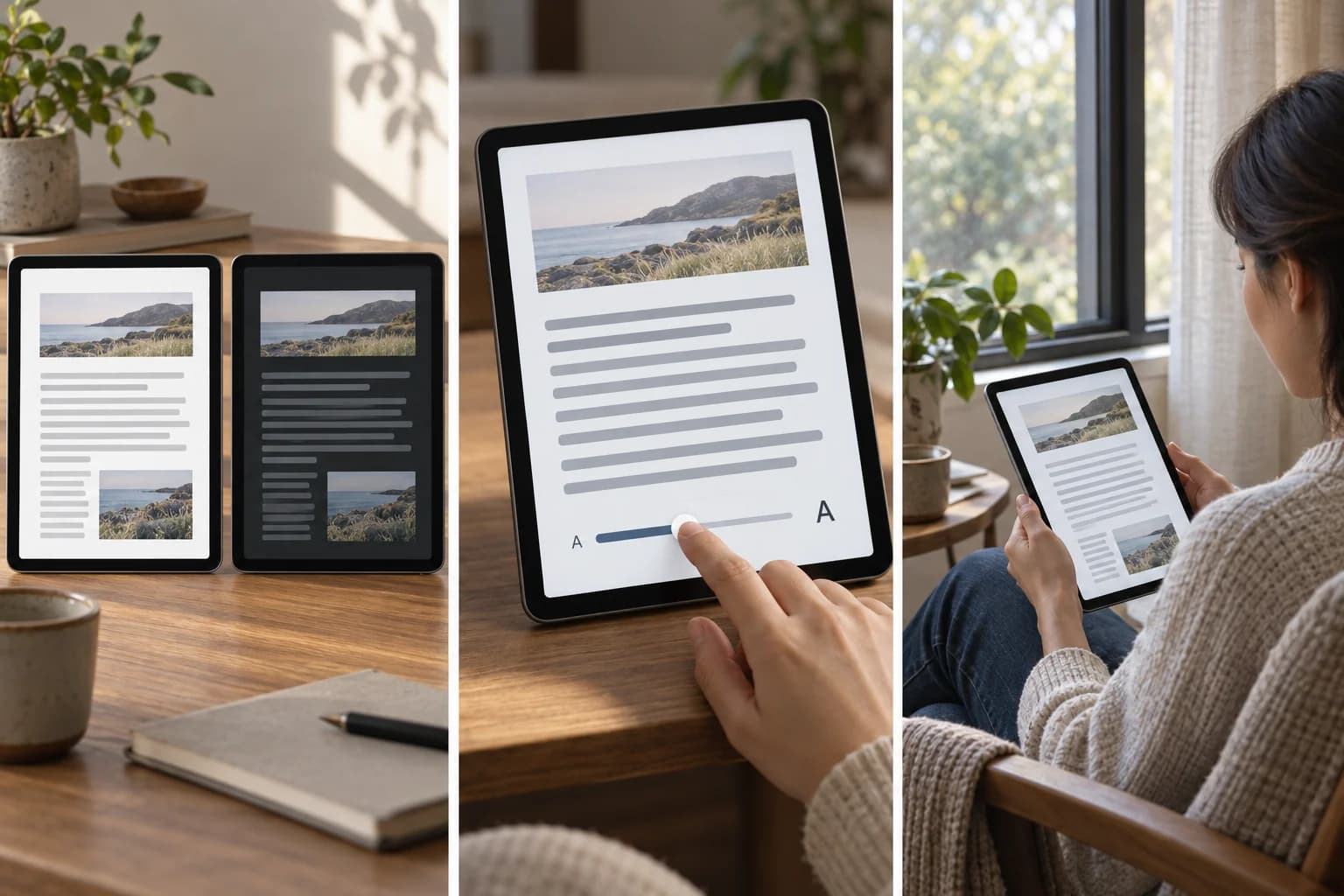
Use the table to compare a task, not to rank people or their preferences. It deliberately keeps the article and layout constant while checking different components. You may find that both themes work, one needs a stronger text colour, or both need better controls. Those are different outcomes and should lead to different changes.
As an explicit arithmetic example, text colour #222222 on #FFFFFF has a calculated contrast ratio of about 15.91:1; #EEEEEE on #171717 is about 15.45:1. Both exceed the ordinary-text threshold. By comparison, #888888 on #FFFFFF is about 3.54:1 and falls below 4.5:1 for ordinary text. These numbers come from the WCAG relative-luminance calculation for the stated colours, not from the generated cover or a reader trial.
Do not treat the slightly higher ratio in the first passing pair as evidence that every reader should choose it. The threshold calculation and personal comfort are different questions. Keep the ratio attached to the exact colours, and keep subjective preferences attached to the person and reading conditions. That separation makes an accessibility comparison clearer than a single dark-versus-light verdict.
| Check | Light and dark versions | Action if it fails |
|---|---|---|
| Article and type | Same passage, size, spacing and layout | Remove unrelated differences before comparing |
| Ordinary-text contrast | At least 4.5:1 under the cited criterion | Change exact text and background colours |
| Large-text contrast | 3:1 only for qualifying large text | Verify size and weight before using exception |
| Secondary information | Links and captions remain readable | Check those colours separately |
| Zoom and layout | Text remains available when enlarged | Fix clipping or inaccessible controls |
| Keyboard operation | Theme control reachable with visible focus | Provide usable control and focus state |
| Personal comfort | Observe your experience in the actual room | Offer adjustable presentation without health claims |
A system preference is a starting point, not a diagnosis
MDN documents the prefers-color-scheme media feature as a way to detect a user's requested light or dark theme through operating-system or browser settings. It lets a site respond to an expressed preference. It does not tell the site why the person chose the theme, whether they have a visual condition, or which colours will meet their needs in every article.
A practical reader-facing design offers a clear theme control as well as an option to follow the system. Show what is selected and make switching possible without losing the reading position. If the interface remembers a manual choice, that should be understandable to the reader. These are design recommendations for a usable long read, not claims that the documented media feature automatically provides all those behaviours.
Check embedded content too. A dark article containing a bright chart, a pale form or an image with important text can create a different experience from its surrounding paragraphs. Preserve the information and verify that controls remain legible. A successful main-text palette does not excuse unreadable secondary content or a theme switch that disappears from view.
Theme choice cannot replace zoom and keyboard checks
W3C's preliminary accessibility checks include useful ways to inspect text size and keyboard interaction. For a long article, increase the display size and confirm that text remains available without being clipped by fixed containers. Check whether headings, captions and controls can still be reached. A theme that looks excellent at the default size may expose layout problems when someone needs magnification.
Use a keyboard to reach the theme control and other important links. Look for a visible focus indicator and confirm that the control's state makes sense. This does not constitute a full accessibility audit, but it can reveal an obstacle that a colour-only comparison would miss. Readers who cannot conveniently use a pointer still need to change the theme and navigate the article.
Do not rely on colour alone to explain which choice is active. A selected-state label, an appropriate control state or another clear indicator can help. The same principle applies to links inside the text: ensure readers can recognise them without requiring an exact hue distinction. Accessibility requires several coordinated decisions, and background polarity is only one of them.
How to keep the reading experience adjustable
For readers, the useful outcome is a set of settings that lets you continue the article comfortably: theme, text size, device brightness and reading position. If changing the theme helps, keep that preference. If enlarging the text helps more, use it. There is no need to turn your experience into a universal claim about another person's eyesight or a proof that one colour scheme is scientifically best.
For publishers, test both themes with the same content and include the easily neglected pieces: links, captions, focus indicators, forms and zoomed layouts. Record exact colours for calculated contrast checks and describe any user observations separately. Do not invent a percentage improvement in reading speed, fatigue or eye strain from a before-and-after screenshot. Such outcomes require evidence beyond this interface assessment.
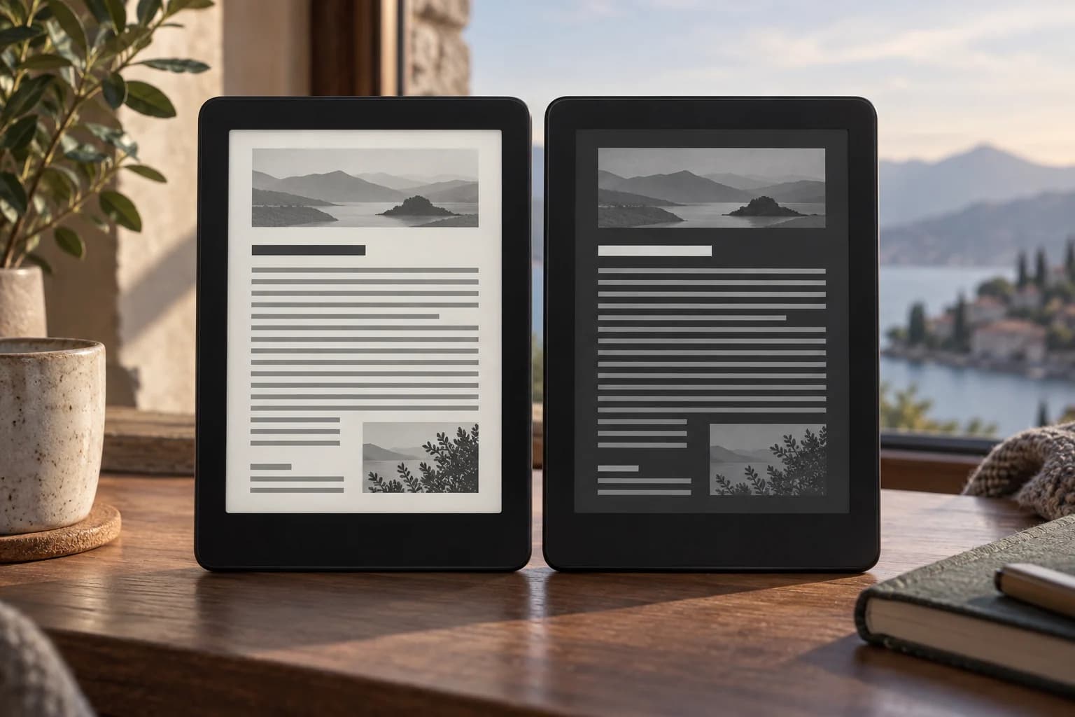
The cover is an AI conceptual illustration of two generic reader screens showing the same invented layout as abstract lines, one light and one dark. It depicts no medical test or actual article-reading trial. The strongest comparison in the article is similarly explicit: equal content and typography, checked contrast, accessible controls and a choice the reader can change.
Questions and answers
Is dark mode always better for your eyes?
This comparison does not establish a universal medical benefit. People and reading conditions differ, and a theme name does not describe contrast, text size, screen brightness or glare. Use a presentation that works for you and keep it adjustable. Persistent discomfort needs individual advice; a visually appealing dark screenshot cannot diagnose its cause or prove that it will improve.
Can dark-mode text fail minimum contrast requirements?
Yes. Foreground and background colours determine the ratio, so faint grey text on a dark background can fail just as faint text on a light background can. Check the exact pair for paragraphs, links and captions. The cited criterion requires at least 4.5:1 for ordinary text and 3:1 for qualifying large text, with stated exceptions.
Do contrast calculations show which theme is easier to read?
No. They demonstrate how specified colours compare with a contrast threshold. The light and dark examples both exceed it; their numerical difference is not a reader-comfort or speed result. Personal preference, size, glare and controls are separate factors. The generated cover does not supply those ratios, which were calculated from the colours stated in the article.
Should websites automatically follow the system theme?
Respecting a requested system preference can provide a useful initial presentation. MDN documents how prefers-color-scheme detects that preference, but it does not determine every accessibility need. A clear manual choice and a follow-system option can make a long read more usable. Check that switching remains available with a keyboard and does not obscure text or lose the reading position.